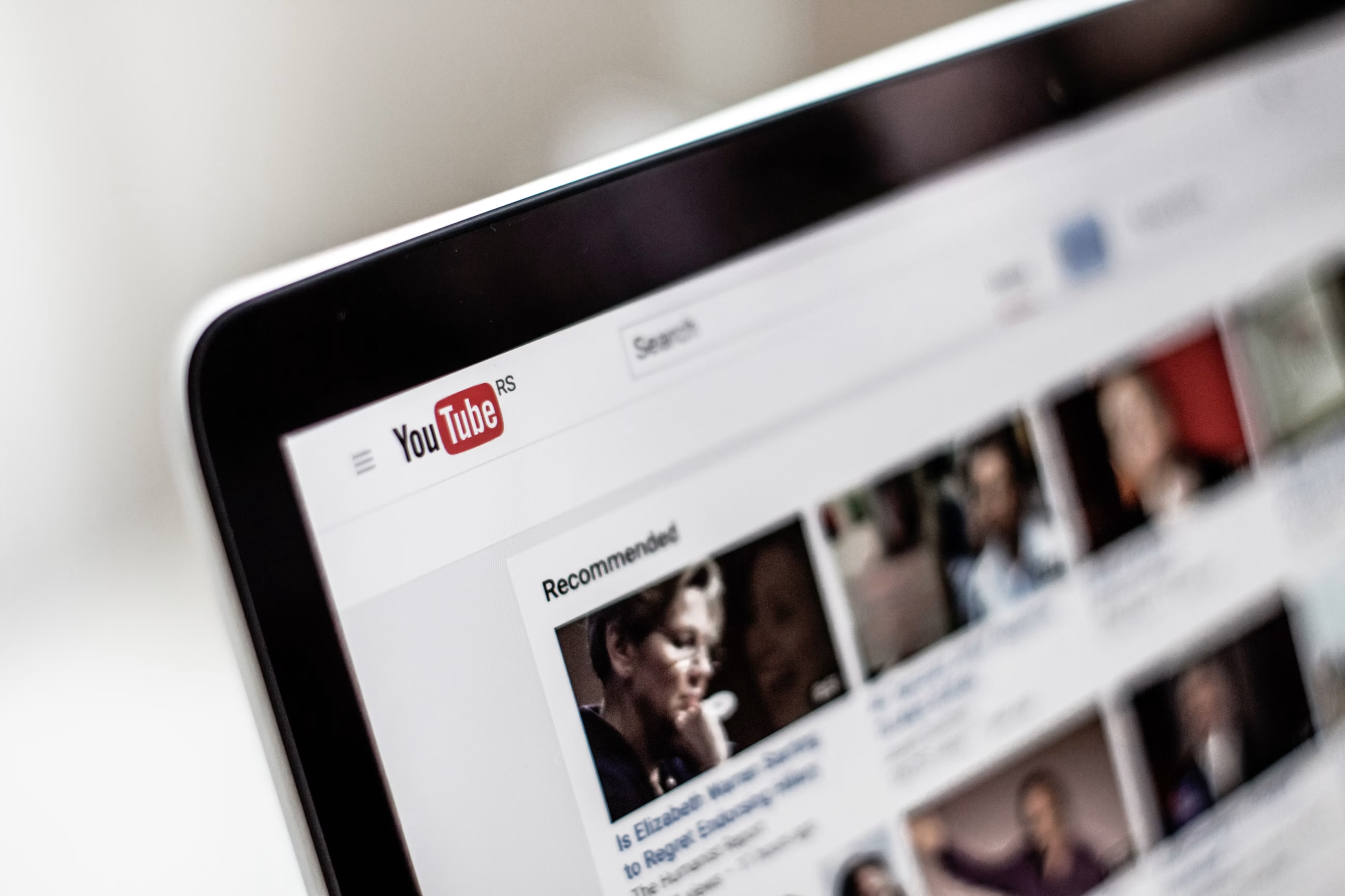
The 1.5-Second Rule: Why Most Channels Fail
Here’s the number that should terrify every creator: 1.5 seconds. That’s roughly how long a thumbnail has to stop a scrolling thumb before the viewer moves on forever. Not 5 seconds, not “long enough to read the title” — 1.5 seconds of raw visual processing before a decision gets made, mostly outside conscious thought.
This is why the old mindset of “the video is the product” is outdated. In 2026, the thumbnail is the packaging, and packaging sells the product before anyone knows what’s inside. You could pour 100 hours into editing, color grading, and sound design, and none of it matters if the packaging fails to earn the click. Nobody browses YouTube evaluating production value — they’re scanning a wall of images, and only the ones that hijack attention in a fraction of a second get opened.
The competitive bar has also moved. Standing out today means operating at the intersection of psychology, color theory, and visual hierarchy simultaneously — not picking one and hoping it carries the rest.
The “10 Commandments” of Design Framework
Commandment 1: Bold Colors & Extreme Contrast
Muted, tasteful palettes are a liability, not an aesthetic choice. Most viewers browse in dark mode, so soft pastels wash out and vanish against a black interface. Push saturation up 15–20% beyond what feels natural, and pair colors that fight each other on purpose — electric yellow text against a deep navy background is a classic combination because the eye can’t ignore it.
Commandment 2: The 5-Word Text Limit
Your title already tells viewers what the video is about. The thumbnail’s only job is to supply the why — the reason they need to know more, right now. Cap your on-image text at five words or fewer. The goal isn’t to explain anything; it’s to open a gap between what’s shown and what’s understood, a gap so uncomfortable the viewer has to click just to close it.
Commandment 3: High-Emotion Faces
Human brains are wired to detect facial emotion in milliseconds — it’s ancient survival wiring, and thumbnails exploit it constantly. A neutral, pleasant expression does nothing with that wiring. Replace it with something extreme: eyes stretched wide, mouth open mid-reaction, visible tears, or unmistakable anger. These aren’t overacting for the sake of drama — they’re triggers that force a cognitive pause, a half-second of “wait, what happened to this person?”
Commandment 4: Strict Visual Hierarchy
A cluttered thumbnail forces the viewer’s eye to hunt for meaning, and hunting takes longer than 1.5 seconds. Instead, build a forced path: face first, text hook second, supporting element third. Achieve this through scale — make the dominant element genuinely massive relative to everything else — combined with background blur and vignette shading that darkens the edges and pulls focus toward the center. The eye should have no choice but to follow the path you built.
Commandment 5: The Squint Test
Design for the size thumbnails actually appear at: smaller than a postage stamp on most mobile screens. Zoom your canvas out to 10%, or physically squint at your monitor. If you can’t immediately identify the subject and the hook at that size, the design has failed, no matter how impressive it looks at full resolution. This single habit eliminates more bad thumbnails than any other single check.
The Science of Attraction (Deep Dives)
Think of facial expressions as a biological cheat code. When the brain registers an intense emotion on another human face, it doesn’t ask permission to care — it automatically searches for the cause. A thumbnail exploiting this doesn’t need to explain itself; the viewer’s own brain does the explaining, and curiosity fills in the blank.
The technical side of this — vignettes, selective blurring, deliberate darkening — exists purely to protect that mechanism. Every distraction you remove from the frame is one less thing competing with your subject’s value proposition, which is the single visual reason someone should care enough to click.
The Professional Methodology
The creators pulling in millions of subscribers didn’t get there by guessing well once. They built a discipline of rigorous data testing — running variations, tracking what actually earns clicks versus what just looks good in isolation, and letting results override intuition. Design instinct gets you a starting point; testing is what turns that starting point into something that reliably performs.
This also means methodology has to keep evolving. What worked a year ago against a less saturated feed doesn’t necessarily work now. Treating your approach as a living system — one you revisit, test, and adjust — is effectively how top channels continue to work with the algorithm instead of against it.